
There's been a pretty good reception for the piece so far (as a longtime Deadspin reader I know it's a tough crowd), but there have been a few recurring comments on the article and social that I want to address here.
1. The Falcons logo making an F
There's a long and delightful tradition of sports logos sneakily incorporating letters into the design. The all-time best example was the logo for the Milwaukee Brewers, which used an "m" and a "b" to make a baseball glove. I am all for secret letters. Except when they don't make any sense.

Part of the problem I have with the Falcons logo is that there's that weird leg sticking out in front. It's unnatural and unnecessary. A bunch of people said it was there because it turns the logo into an F. Here's the best illustration of that effect I could find on the internet, from SB Nation:
:no_upscale()/cdn.vox-cdn.com/uploads/chorus_asset/file/10610385/falcons_.jpg)
Uh I guess? I guess that's an F? It's sort of a long stick with two things moving off to the right in a general F pattern? So, OK, the body makes an F, but please grant me that it is a terrible F.
But here's the thing: You don't need to make an F when you are showing a falcon. It's a picture of a Falcon. This isn't a children's book. If you want to incorporate a letter, incorporate an A, for Atlanta! If there was a team called the Oklahoma Zebras, you wouldn't have a picture of a zebra with a hidden Z...it's already a zebra! You know what it is! This whole thing sucks, please fix it.
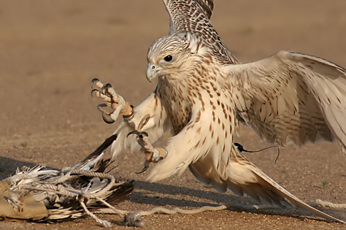
2. The Falcon logo has its foot out because they have their feet out when pouncing on prey
A bunch of people said that it was normal for a falcon to have its foot out because that's how they attack prey. Yeah, sure, falcons use their feet to attack prey...but not with their wings down! Falcons sweep their wings back to extend their feet when they attack. The bird in the logo is sweeping its wings down. Completely unnatural.
3. The Arizona Cardinals Should Be The Arizona Pyrrhuloxias Instead
Hell yes, hell yes they should. I don't care that no one would be able to pronounce it.
4. I Should Have Included the Toronto Raptors Because Dinosaurs Are Birds
Congrats to the 2018-19 NBA World Champs! I hope Kawhi stays! Anyway, yeah birds are dinosaurs, but dinosaurs aren't birds. Thanks.
Okay that's about all thanks for reading stay in school don't do drugs vote! support your local library and give to environmental causes bye.
lol i love the humor here :)
ReplyDeleteThis comment has been removed by a blog administrator.
ReplyDelete