Showing posts with label birds and sports. Show all posts

Tuesday, June 8, 2021

A quick post about Pat Hentgen, Major League Baseball player


As longtime readers (?) of this interblogsite know, I like to think about sports teams named after birds. Good times fun times all is well. But one angle I've never considered in all of this how the players feel about playing for a team named after a bird. 

And I still don't know that and can't really pursue it because I'm too busy and too lazy at the same time.

But if I were to talk to anyone I'd talk to Pat Hentgen, a Cy Young Award winner and three-time all-star pitcher who played between 1991 and 2004. He was a really good player and, for our purposes, has the unique status in major league baseball history as being the ONLY player to play for all three teams named after a bird (the Toronto Blue Jays, Baltimore Orioles, and St. Louis Cardinals), and ONLY those teams.

Every time Pat Hentgen put on a major league uniform there was a bird on it somewhere. Pretty cool.


UPDATE


Thursday, May 14, 2020

Best of Twitter: Recreating the St. Louis Cardinals Logo with a Real Bird


Twitter is just the best sometimes.

For instance, the other day I was making some of my usual meaningless observations about birds, this time comparing a photo of a Baltimore Oriole on my feeder pole to one of the logos of the Baltimore Orioles baseball team:

Then, I wondered how close one could actually get to replicating that logo, which led me to:
I expected nothing to happen. Certainly lazy old me wasn't going to do anything about it. But then, Twitter. User Tess Rouillard (@WhiskyEyeBrews) actually went and built the dang Cardinals logo, and put it up near her feeders! What!
The trap, as she said, was set. It didn't take long for birds to visit, though they weren't the species we were looking for. A Common Grackle was first up to bat. Then a Blue Jay, which is actually a pretty hilarious mashup of two different MLB teams: Then, this morning, less than a day after I originally posted the thing to Twitter, Tessa and her feeders came through. A real live Northern Cardinal perched on the Cardinals logo!! Incredible! I think, frankly, that this is one of the coolest things to ever happen on the internet. I think Tessa Rouillard so much for her ingenuity and creativity and motivation. I'm hoping that the Cardinals team will see this and give her some credit for her work! Sports!

Friday, June 28, 2019

Deadspin logo piece - Responses


I published a fun piece on Deadspin.com this week about fixing the birds pro sports logos. I worked with Ashley Anderson of Hidden Stash Art on the artwork, and she did a fantastic job.

There's been a pretty good reception for the piece so far (as a longtime Deadspin reader I know it's a tough crowd), but there have been a few recurring comments on the article and social that I want to address here.

1. The Falcons logo making an F

There's a long and delightful tradition of sports logos sneakily incorporating letters into the design. The all-time best example was the logo for the Milwaukee Brewers, which used an "m" and a "b" to make a baseball glove. I am all for secret letters. Except when they don't make any sense. 


Part of the problem I have with the Falcons logo is that there's that weird leg sticking out in front. It's unnatural and unnecessary. A bunch of people said it was there because it turns the logo into an F. Here's the best illustration of that effect I could find on the internet, from SB Nation:

Image result for atlanta falcons logo F

Uh I guess? I guess that's an F? It's sort of a long stick with two things moving off to the right in a general F pattern? So, OK, the body makes an F, but please grant me that it is a terrible F. 

But here's the thing: You don't need to make an F when you are showing a falcon. It's a picture of a Falcon. This isn't a children's book. If you want to incorporate a letter, incorporate an A, for Atlanta! If there was a team called the Oklahoma Zebras, you wouldn't have a picture of a zebra with a hidden Z...it's already a zebra! You know what it is! This whole thing sucks, please fix it.

2. The Falcon logo has its foot out because they have their feet out when pouncing on prey

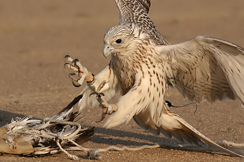
A bunch of people said that it was normal for a falcon to have its foot out because that's how they attack prey. Yeah, sure, falcons use their feet to attack prey...but not with their wings down! Falcons sweep their wings back to extend their feet when they attack. The bird in the logo is sweeping its wings down. Completely unnatural.

Image result for falcon attack

3. The Arizona Cardinals Should Be The Arizona Pyrrhuloxias Instead

Hell yes, hell yes they should. I don't care that no one would be able to pronounce it.

4. I Should Have Included the Toronto Raptors Because Dinosaurs Are Birds

Congrats to the 2018-19 NBA World Champs! I hope Kawhi stays! Anyway, yeah birds are dinosaurs, but dinosaurs aren't birds. Thanks.

Okay that's about all thanks for reading stay in school don't do drugs vote! support your local library and give to environmental causes bye. 

Tuesday, February 3, 2015

Important Answers to Major Questions: What Kind of Binoculars Was Robert Kraft Using During the Super Bowl?


Needless to say, as a lifetime fan of the New England Patriots, I enjoyed this weekend's Super Bowl. For those of you non-sports-types that might be reading this, the Patriots defeated the Seattle Seahawks (props for the bird-themed name, though) thanks to a miraculous goal-line interception. It was fantastic.

During a cutaway shot of the Owner's Box, Patriots owner Robert Kraft lifted binoculars to his face to look, presumably, at some action on the field. As a birder, this was an extra little bonus, as I enjoy seeing what looks like people birdwatching. I jumped to Twitter to register my delight:


However, the binoculars were only on screen for a moment, and my screenshot wasn't detailed enough for me to see what kind of equipment Mr. Kraft was using.  Again, Twitter was my ally (this is the next morning, as I was too busy celebrating the win that night):


I got a couple responses.  Some were of the wiseacre variety:


Others were actually helpful, and illustrated a good birder's attention to detail:


Finally, there was confirmation, in the form of #BrandInteraction:


Yep, Kraft is using Swarovski's CL Companion binoculars, which received an "Outstanding" mark from the Best Binocular Reviews website. They retail from Swarovski online for a cool $1,110.  A little out of my price range, but pocket change for a guy who is literally wearing Super Bowl rings as cuff links.  Go Patriots.  Go Birders.

Thursday, July 24, 2014

Put A Bird On It. Any Bird.


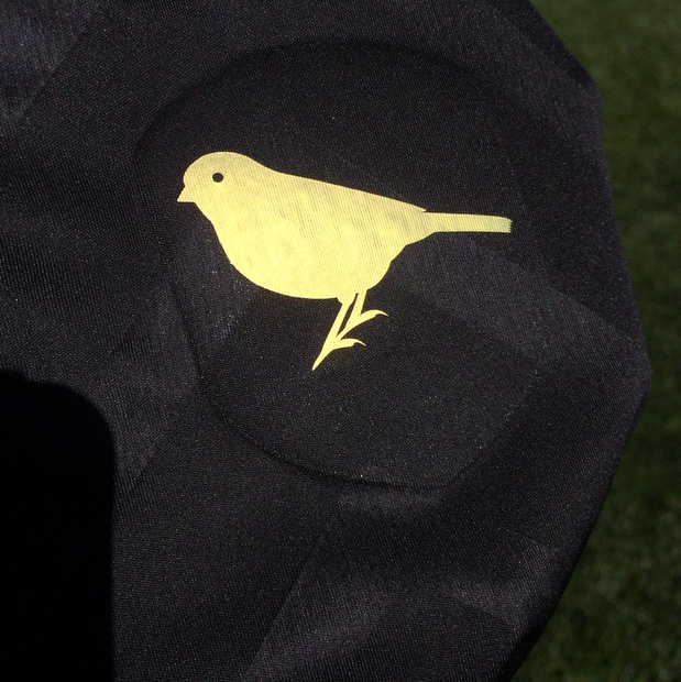
The Major League Soccer All-Star Game is going to be held in Portland, Oregon* this year, and they've just released images of the jerseys the players will be wearing.  Portland, OR being Zany Quirky Portland, OR (TM) (c), they stuck a bird on the inside of the shirt, a reference to the Put a Bird On It skit from the tv show Portlandia.

That's all well and good and Portlandians can check the "delightful irreverence" box that's probably required for anything officially done in Portlandia.  But something sticks in my craw.  The MLS release about the jerseys says that the bird on the jersey is a western meadowlark, the state bird of Oregon.  Let's take a closer look.


You've got to be shitting me.  That's not a meadowlark.  It's blatantly not a meadowlark.


Why even bother?  Does it cost more to print the silhouette of a meadowlark instead of that sparrow-type thing?  If you want it to be a meadowlark, make it a meadowlark!  If you don't care, then don't say it's a meadowlark!  Lord.  The stupidity of state birds is something I've discussed at length, but apparently my rantings have not changed anything.  Screw you, Portland, Oregon, and go Sounders.


*In 1845, two dudes with two very-1845 names, Asa Lovejoy and Francis Pettygrove, wanted to name their new settlement on the Pacific coast after their respective hometowns.  Lovejoy was from Boston, Massachusetts and Pettygrove was from Portland, Maine, also the beloved hometown of yours truly.  They decided that the only way to fairly choose a name was a best-of-three coin flipping contest.  Francis, using those strong Maine thumbs, flipped a winner, and proudly proclaimed this new site Portland, of the Oregon Territory!  Fast forward to today, and everyone's all "Oh, I am going on vacation to Portland" or "Today, the weather in Portland is..." without clarifying that they're talking about the also-ran city in Oregon and not the original American city in Maine.  It's bullshit and I hate it.

Wednesday, May 7, 2014

Grading Bird-themed Minor League Baseball Teams


Baseball's long, slow, hot, gorgeous season has begun, not just in those cities hosting Major League teams but smaller cities and towns across the country.  According to this list on Wikipedia, there are 27 minor and independent leagues in North America, many with teams named after those most endearing and non-threatening of mascots: birds.

You likely haven't heard of most of these teams unless you live in one of America's small municipalities or, like, did a project in school about minor league teams or something.  Well, friend, relax.  Let me save you the trouble of figuring out which teams have done a good job with their avian themes, and which ones are unworthy of their winged mascots.

AAA - INTERNATIONAL LEAGUE

Rochester (NY) Red Wings

So, they got their name in 1929 when they became the St. Louis Cardinals farm team (bonus points there), and a few extra bonus points for at least having a bird mascot - the NHL Detroit Red Wings aren't named for birds - but what the hell is this?  Why would they do this?  It's not a real bird, or even close.  Turn this in to a tanager or something, or a real hawk, then we'll talk.

Grade: D


Toledo Mud Hens


History has it (via Wikipedia) that the Toldeo Mud Hens were originally the "Swamp Angels" but they became known as "Mud Hens" because the swamp they played in was filled with American Coots.  A cool story, and an interesting bird to be named after, but this frigging thing doesn't look like an American Coot at all.  What even is this?  Why is this?

Grade: C-


AAA - PACIFIC COAST LEAGUE

Memphis Redbirds

This is the first athletic use of a cardinal mascot that doesn't have a yellow bill.  Do you hear that?  THE FIRST ONE!  Problem is, it's a fucking red bill instead.  Is there a shortage of orange?  What does everyone have against orange?  Adding insult to injury, the mascot has a yellow bill.  I love Memphis, but I'm furious.

Grade: B- 


Oklahoma City RedHawks

 I just want to check and see if teams are allowed to use birds that aren't red.  Is that permitted?  Did Congress pass something when I wasn't looking?  What the shit is a RedHawk and why isn't it two words?  It's not a bird ugghhh and that bat would break his beak this is the worst day of my life.

Grade: C-


Thursday, March 27, 2014

Making Avian Major League Baseball Logos More Accurate


God I love baseball.  It's the greatest American sport because it is a big fat apple pie baked with all the most American ingredients: quasi-athleticism, belts, anthems, expanses of green grass, bubble gum, sitting around, boozing, and fresh air.  It's the only sport I know where players can eat food while they're playing.   I've loved it forever.

Loved it longer than I've loved birding, in fact.  But that's another great thing about Major League Baseball - it treats birds pretty well.  There are three MLB teams named after birds: The Baltimore Orioles, the Toronto Blue Jays, and the St. Louis Cardinals.  First, these are great choices because they're specific.  No invented baloney "Thunder Falcons" or anything, not even generic "hawks" or "eagles." These are classic, small, passerines.  These are real birds.

In addition to the names of the teams, the logos do these birds justice.  For the most part they're accurate, ornithologically speaking.  For the most part, but not completely.

I wanted to take this opportunity to offer some edits to the logos of bird-named MLB teams, to see how different they'd look if given full respect to their avian inspirations.  Let's see how it'll look.

Toronto Blue Jays

The Blue Jays have a beautiful set of logos.  They'd tried to "toughen it up" a couple years ago, using logo showing an animated Jay angrily gripping a ball...but everyone knew it just wasn't them.  The side-facing Jay with the split blue and white lettering is the Blue Jays, and it came back to stay.  I grew up with them in powder blue, and I wouldn't mind it that came back full time.


Anyway, the Jays logo, frankly, takes few liberties with the actual Blue Jay.  The biggest difference - the only difference - is that the bill and neck stripe of the Blue Jay is black.  Well, the bill for sure.  The neck stripe is a bit tougher to see.  It's interesting, Blue Jays are such an easily-identified bird that field guides don't seem to pay much attention to the details.  It's tough to tell whether the neck is a midnight blue or a black, but most images see it as black, so I'll go with that.  A simple shift leads to a slightly different logo.


Interestingly, the Jays had shifted to black uniforms a few years ago, part of the "black for black's sake" (or BfBS) uniform trend highlighted by UniWatch.  The Jay's black uniforms were roundly criticized, partly because black wasn't a traditional part of their color scheme.  If the Blue Jays had simple changes their colors to more accurately reflect real Blue Jays, they could have adopted black uniforms with no problem.  Alas.

St. Louis Cardinals

One of the oldest and most storied franchises in pro baseball, St. Louis has been making cardinals cool for decades.  Northern Cardinals are an interesting case, they're not an intimidating or tough bird, but they're so colorful and common that they're one of the few birds that everyone knows.

As I've covered before, despite their ubiquity Northern Cardinals are frequently misrepresented in broader culture.  No one can seem to get the colors right, mostly insisting that they have bright yellow beaks.  They don't.  They just don't.


Sunday, January 5, 2014

Birds at Large: Rice Owls Baseball Jerseys


Rice University has got itself some new baseball jerseys, and they've got owls on them.  It's a logical choice, because Rice's sports teams are all named the Owls.  Rice has got owls on its seal, and on its logo, and the kids apparently do an "owl" hand signal to let you know they're Ricers.  Owls are a thing, understand?

As far as I can tell, no specific species of owl is used for the Rice Owl owl.  The use of owls comes from their seal, which uses stylized versions of the old Owl of Athena image, representing "wisdom."  Without a specific species to base its designs on, Rice has taken liberties with its use of the owl, employing this thing, whatever the heck this is, and this come-hither bird.


The new jerseys are a nod to the classic "birds on the bat" logo of the St. Louis Cardinals in the pros.  It looks pretty nice - lovely stitching and I love how the bat goes through the top of the R.  Gotta admit, it really bothers me that the birds aren't a real species.  Why not?  Why not just do it?

That's the thing that bugs me most about these Birds at Large posts.  It takes so little effort to just make it a real bird.  This guy was obviously modeled after Great Horned Owls...why not just slap a little orange around the eyes?  Great Horned Owl plumage is not copywrited!  I dunno.  Maybe they didn't want to introduce another color for cost reasons and fine (though you could probably fleck with the yellow and brown), but if you're gonna do something, do it right.  Rice you were close to something perfect, but it looks like your streak of owl insanity will continue.


Wednesday, August 7, 2013

Ornitholgical Accuracy of the New Orleans Pelicans


When the Atlanta Thrashers packed their sweaty skates and headed to Winnipeg to become the Jets in 2011, the Bird-Named Big 4 Sports Team Club was down a member.  Last year 11 of the Big Four teams ran behind a flapping mascot:

  • NBA's Atlanta Hawks
  • NFL's Baltimore Ravens, Philadelphia Eagles, Atlanta Falcons, Arizona Cardinals, and Seattle Seahawks
  • NHL's Pittsburgh Penguins and Anaheim Ducks (I don't count the Chicago Blackhawks, who were named for a leader of the Sauk tribe, or the Detroit Red Wings, who were apparently named after a Montreal Cycling Club), and
  • MLB's St. Louis Cardinals, Baltimore Orioles and Toronto Blue Jays
Much to my surprise, though, events conspired over the NBA winter to restore the club membership to an even dozen.  Back in 2002, the under-attended Charlotte Hornets shipped their franchise to New Orleans.  Just two years later, however, all was apparently forgotten and Charlotte unveiled a new basketball squad, the Bobcats.  Well, the Bobcats suck, and worked a deal with New Orleans to bring the Hornets name back to Charlotte, where people still hardly give a crap.

That left the New Orleans team nameless, and after contemplating Mosquitoes (haha ok), Swamp Dogs (ughhhh), Bullsharks (cool) and Rougarou (what), the team owner went with the New Orleans Pelicans.

Fantastic!  I love this for so many reasons.  First, as I've said before, I just associate Brown Pelicans with Louisiana and always give bonus points for teams named after local birds (see: Baltimore Orioles).  Second, I also love it when teams pick birds that aren't typically "fierce" like hawks or eagles.  Third, the Pelicans name has New Orleans roots, once being the name of a minor league baseball team with this adorable logo.  Good times all around.


The Pelicans unveiled their logos a couple months ago, and I think now that the initial excitement about the name is over I want to look at these items with a critical eye.  Frankly, from an ornithological perspective, the jury is out.

The concern here is that they're not using the correct species.  There are two species of pelican in these United States: the American White Pelican and the Brown Pelican.  While White Pelicans can be found in Louisiana, it's usually in the winter, when they huddle in big groups in the middle of big lakes and reservoirs.  I've seen it.  They're cool birds all, but they're pretty pathetic in the winter time, and certainly not worthy of naming a cool NBA team after.

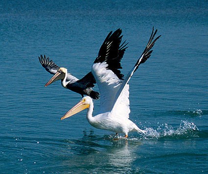
The New Orleans Pelicans need to be modeled after Louisiana's state birds, the Brown Pelican.  These are the cool pelicans: the ones that hang out at the beach cruising low lookin' at babes, the pelicans who will tell you they hung out with Dr. John before he went to med school.  If you know what I'm saying. [Below photo shows a Brown Pelican on the above left, and an American White Pelican below, with its feet in the water]


Looking at the logos, I'm not sure.  The baseball logo, linked to above, shows a white pelican, but it's old and colorless so I don't know.  The logos shown above are ambiguous.  The underwings don't match either species: White Pelicans are white and black, while Brown Pelicans are (mostly) just brown.  The face, shown head on, is white for both species, so we're good there.  The beak, I suppose, could match either species, but the red coloring in the logo looks more like a breeding Brown Pelican than the orange of a White Pelican.  Deal.

I just want to make sure everyone knows that it's a Brown Pelican, not a White.  Grantland's recent post on nicknames for the Pelicans illustrates the thing with a White Pelican.  I was unsuccessful in conveying jovial sarcasm when pointing this out to the author of the piece, but hey, it was his mistake, not mine (and who doesn't check the photos that go with the post?)


[Also, a not on the cap photoshopped onto the pelican in the linked-to blog post above: that isn't listed as an official logo or in the NBA team store for the Pelicans.  I don't know where that hat came from but if it's real, it's a White Pelican and completely inaccurate, speaking from a birding perspective.]

All in all, I'm thrilled to have the Pelicans in my life.  Louisiana's got a great birding history and reputation, and I look forward to seeing LA birders crank around Grand Isle in Pelicans gear.  I hope it's also used to teach non-birders about their state bird: a big cool bird, a survivor of hurricanes and oil spills, and just the kind of goofy mascot the an eccentric populace can get behind.  Go Pelicans.


Tuesday, January 20, 2009

Bird-Related Sports Uniform Designs: Part 2


In the world of bird-related sports teams, the Baltimore Orioles stand head and shoulders above the rest. Not only is their logo among the most ornithologically-accurate of all the sports teams (except for the eye and bill color), but they are the only team whose name is the same as the whole species' common name. Baltimore Orioles and Baltimore Orioles.

It's a great idea, and one that more cities have unfortunately not taken advantage of. Why can't I go catch a California Towhees football game? Who wouldn't want Key West Quail Dove season tickets?

Friday, January 16, 2009

Bird-Related Sports Uniform Redesigns: Part 1


I really didn't want to do this yet, but I just got excited and couldn't stop.  


While writing a couple posts on bird-themed sports logos for 10,000 Birds I got to thinkin' about a couple things.  First, I wondered what it would be like if sports teams modeled their uniform designs on the uniform designs (aka plumages) of their mascots.  What if the Philadelphia Eagles dressed like Bald Eagles?  

So I found a bunch of uniform templates online and made some crude redesigns of current teams.  Here's what I've got:

Philadelphia Eagles

Saturday, December 6, 2008

Birds and Sports Logos


 [This post was originally run as a guest post on 10,000 Birds]

Hello 10k Birds readers! Thanks, Mike, for the invite, this is one heck of a site you guys got yourselves.


OK, so, on my own site I sometimes like to explore the ways birds and birders are misunderstood by the media and the general public.  It may be nitpicky, and the people may mean well, but I've spent a lot of time honing my power of bird-observation, and I'm not going to turn it off just because I'm at home on the couch.  Plus, if you're producing a big-budget American TV commercial, how hard is it really to make sure that the bird you're using isn't restricted to, say, the South American rainforest?  Isn't that your job?  I mean, there's a reason he's named Smoky the Bear and not Smoky the Wallaby, right?

Regardless of whether some hotshot commercial producer cares, I care.  You know what else I care about?  Sports.  And, as it just so happens, sports teams represent (and misrepresent) birds all the time in their team logos.  So today I'm going to do a breakdown, Uni-Watch style, of the best, okay-ist, and worst bird-themed sports logos in sports.  Grades will be given out based on ornithological accuracy and whatever other criteria I see fit.  [Note: I'll be sticking primarily to professional American sports: MLB, NBA, NFL and, I guess, the NHL.  For a list of bird-themed college teams with some snarky commentary, look here.]  Let's do it.

Major League Baseball

Baltimore Orioles.  Although they are a perennially crummy baseball team, the Baltimore Orioles represent the pinnacle of bird-sports achievement.  First, they are the only team that I know of which includes the team's geographic location as part of a species name: the bird is named the Baltimore Oriole, and the team is the Baltimore Orioles.  Genius.  I really wish more teams would do this, and someday bird-nerds around the country could celebrate when the California Condors play the Nashville Warblers in the World Series.  

Second, the Orioles logo is, ornithologically, spectacular.  Although the logo hasn't always been so accurate, the current version, at least compared to some of the logos we'll see later on, looks to be right out of a field guide.   Closer inspection reveals some discrepancies, however.  Unlike the bird in the logo, actual male Baltimore Orioles have gray/blue bills and no cream eye-ring. Real birds also show a good deal more white in the coverts and secondaries than the logo bird.  I'll let those details slide as artistic license, though, and at least the team isn't making a mockery of the bird.  Oh, wait...let's move on.    Grade = A

Toronto Blue Jays.  Another mediocre, American League East baseball team which has chosen a smallish, not-particularly-intimidating bird as its mascot.  I love the logo, though.  At least, I love the one the one they used to wear, before they started to make a mess of things.

Like the Orioles, the Blue Jays logo isn't ornithologically perfect. The biggest difference is, of course, that real blue jays have black bills and collars, not dark blue.  It's a pretty logo, though, and it's not a bird that traditionally gets the sports-team treatment, so it's OK in my book.  These guys, however, must be destroyed.  Grade = A-

St. Louis Cardinals.  As far as I can tell, the Cardinals are the oldest bird-named team in the country since changing over from the weirdly-named Brown Stockings in 1900 (and that would be this kind, not this kind).  And it's a good thing, too, because their logo is classic.  It's not perfect, though.  The beak and legs are bright yellow, while on a real male Northern Cardinal they are red/orange and dark pink, respectively.  The eye of the logo is also not the black it would be in real life, but, as with the Orioles, I'll let that slide as artistic license.  Note that the logo used by the Cardinals from 1967-1997 get the beak and legs colors a bit more realistic, and adds a funky little hat. Good work, St. Louis.  Grade = A

Boston Red Sox.  What do the Red Sox have to do with birds?  Am I just putting them on this list because they are my favorite sports team?  Well, yes and no.  Check out the Red Sox "B" emblem.  Got it?  Okay, now turn the B ninety degrees clockwise.  What do you see?  Yes, it's an owl.  Isn't that cool?  Somewhere along the line I thought that it was used as a logo for some college (Rice Owls?  Temple Owls?) but I haven't been able to confirm that.  Grade = A for coolness

The National Football League

Atlanta Falcons.  Alright, here is the time for some real tough, badass birds!  None of these wimpy orioles and jays, we want some tough birds to represent some tough guys!  And what could be tougher than a falcon?  The fastest birds in the sky!  Lightning-quick raptors that swoop from the sky!  Surely the Atlanta Falcons would honor this noble family through a cool logo! 

Excuse me. Excuse me. What the hell is that? Is THAT your falcons logo?  That looks awful!  That's nothing like what falcons look like!  OK, maybe it's just a "hip, new" thing, and your older logo was better. No! Awful!

Ugh.  Where to begin?  First, falcons have very distinct, angular wings, a feature completely botched in the logo (the logo bird's wings look more like, what, passerines?).  Second, although there is such a thing as a Black Falcon, it lives in Australia, not Atlanta.  And what's with the leg sticking out?  Is he injured?  Sigh.  So much wasted potential.  Grade = D-

Philadelphia Eagles.  I mean, it's OK. It gets points for being intense, it loses a bunch of points for being green and silver. I'm not gonna hate on it, but eagles are done much better in other places. Grade = C

Arizona Cardinals.  Unlike the baseball team, these Cardinals just went with the head.  Like the baseball team, though, the Arizona Cardinals have miscolored the bird's break and eyes.  I'm generally in favor if this logo, but it's nothing to write home about.  Grade = B-

Seattle Seahawks.  As been covered on this website before, a Seahawk is another name for an Osprey. Although this logo isn't exactly realistic, it's done in the local Native American style, so I'm not going to dock much points. Seattle sports are miserable enough right now without me piling it on. Grade = C  

Baltimore Ravens.  Look, I really want to like this logo.  I think Ravens are a great mascot, and an underappreciated bird.  I like the Baltimore - Edgar Allen Poe's "The Raven" connection.  But...it's purple.  It's unoriginal.  It's ugly.  Grade = C-

The National Basketball Association

Atlanta Hawks.  The NBA is the league with the least number of bird-related teams, with only the Hawks representing.  Annnnd it's a pretty crummy logo, at least from an ornithological perspective.  I researched as best I could (great website there, by the way), and I don't think there are any red hawks like the one in the picture, and certainly not in Atlanta.  It's not so bad, though.  It's a pretty good hawk, for a generic one.  Plus, the Hawks get a few bonus points for making one my my favorite logos ever.  Grade = B

The National Hockey League

Before we get into the real teams, there are a couple quasi-birdy NHL teams we need to get out of the way.  First, the Chicago Blackhawks are named after Chief Black Hawk, not a bird.  Second, while the logos for the Detroit Red Wings, Philadelphia Flyers and St. Louis Blues use wing imagery, they are not countable here.  Moving on.

Pittsburgh Penguins.  The Penguins have a couple of logos, and they are both awesome.  For the skating penguin, regardless of whether or not it's a real bird, how could you not love that?  Adorable.  For the older penguin head logo, it appears to be modeled on the Emperor, and it looks pretty good to me.  I also give the team a lot of respect for picking such an untraditionally friendly bird for a mascot (it's a winter thing, I think). Great job, Penguins. Grade = A

Atlanta Thrashers.  Oh, Atlanta, what are we going to do with you?  Three bird-related teams, and three crappy logos.  Atlanta's hockey team is named after Georgia's state bird, the Brown Thrasher, which is convenient because "thrashing" is also one of those macho sports words.  Too bad the logo looks like crap.  Ugh.  I'll grant that actual Brown Thrashers aren't visually distinctive, but that logo is embarrassing.  Atlanta, for shame.

About Us | Site Map | Privacy Policy | Contact Us | Blog Design | 2007 Company Name